Design Opportunity
As part of a semester-long project, our team worked with UEGroup and AdventHealth to create a mobile application to assist 60-65-year-olds in finding a medicare plan that adequately met their needs.
Team Members
Leah Neustedter, Camile Hardt, Andrew Johnson, and Yue Zhao
Personal Contribution
Conducted user interviews, championed experience map and persona development, co-led competitive analysis, collaborated with the team on iterative sketching and prototyping, and conducted user testing.
Final Deliverables
1. Design Documentation: A document that clearly communicated all of our methods and design decisions including our goals and rationale.
2. High-Fidelity Interactive Prototypes: A research informed interactive design to simulate the experience of the medicare application.
User Group
American citizens approaching the age of 65 who need to find a medicare plan that best fits their needs but are overwhelmed by the amount of information provided across a variety of resources.
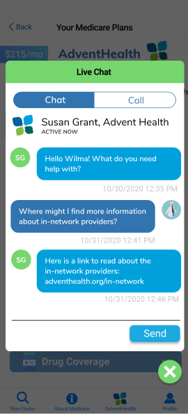
Final Solution: AdventHealth Medicare Informational App
Research
Secondary Research
The goal of our secondary research was to grasp the different aspects of Medicare and how it works, design apps for senior citizens, and application usage of our user group.
What we learned
-Applications must be designed with high contrast, large font sizes, and clear feedback for our specific user group.
- Seventy-nine percent of people between 50 and 64 years of age have a smartphone and spend approximately 55.6 hours a week on their smartphone according to a study conducted by the PEW Research Center.
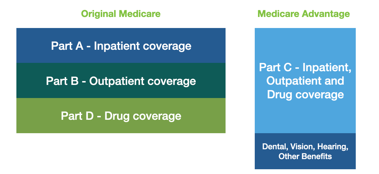
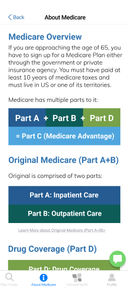
- Medicare consists of four parts A-D. Parts A, B, and D are part of medicare original while part C is Medicare Advantage which is provided by a private healthcare provider such as AdventHealth.
Competitive Analysis
The purpose of this was to better understand existing medicare applications on the market and comprehend their strengths and weaknesses to help inspire and inform our ideation.
Approach
We looked at and analyzed key features of the top three medicare applications on the market. These included Medicare Plan Finder, What's Covered?, and My Medicare Question. This allowed us to understand how we could strengthen our final design based on the features in already existing applications.
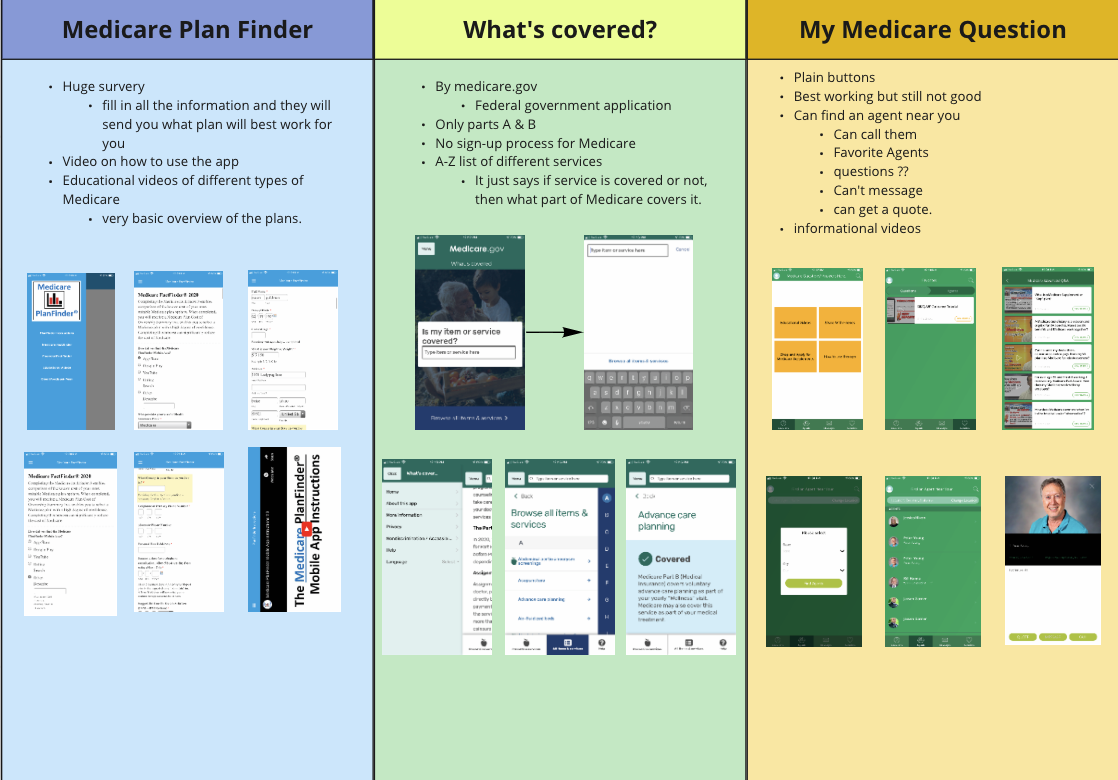
Key Takeaways
- Already existing applications lack a welcoming UI, personalized experience, and have confusing information architecture that makes it difficult for our user group.
- With the growing amount of smartphone owners in our user group, there is a design opportunity to create an informational app that effectively conveys this information to our user group.
User Interviews
The purpose of conducting user interviews was to understand how people are currently choosing their medicare plan with the already existing resources as well as identify issues that these individuals ran into while trying to understand the current Medicare process.
Approach
We conducted 9 interviews with stakeholders from two key groups including people who have already signed up for Medicare, and a medicare specialist from the State Health Insurance Assistance Program.
Important Questions Asked
1. What emotions do you associate with the process of learning about and signing up for Medicare?
2. What Medicare plan do you have and how did you decide that that was the correct plan for you?
3. What struggles did you face when learning about the current Medicare plans available? What resources were helpful to you?
What We Learned
- Our user group was overwhelmed when learning about Medicare due to the information coming from a variety of different channels and formats. Even though the people we interviewed currently have a plan, they are not familiar with its benefits.
- Every experience is different. Each of our users has different expectations and needs for their Medicare plan which emphasizes the need for a personalized experience within our application.
- There is a lack of empathy for what our user group is going through. This is a milestone in their life and they need support due to the feeling of growing old.
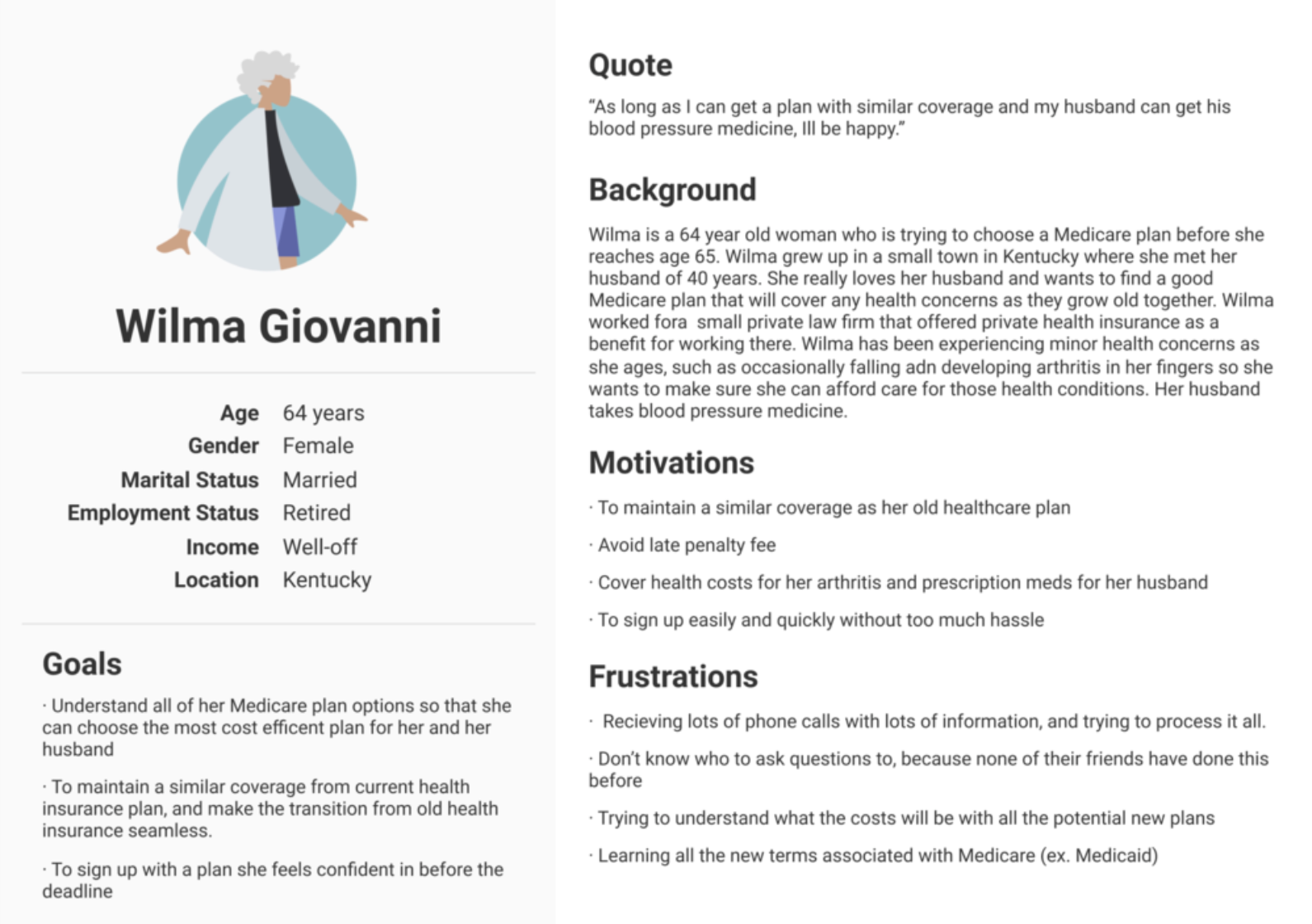
Our Persona
Developing a persona allowed us to synthesize our research as well as build empathy for our users. It allowed us to think through the needs of our users and serve as a tool to refer back to so that we could ensure our goals for our designs aligned with the goals of our user group.
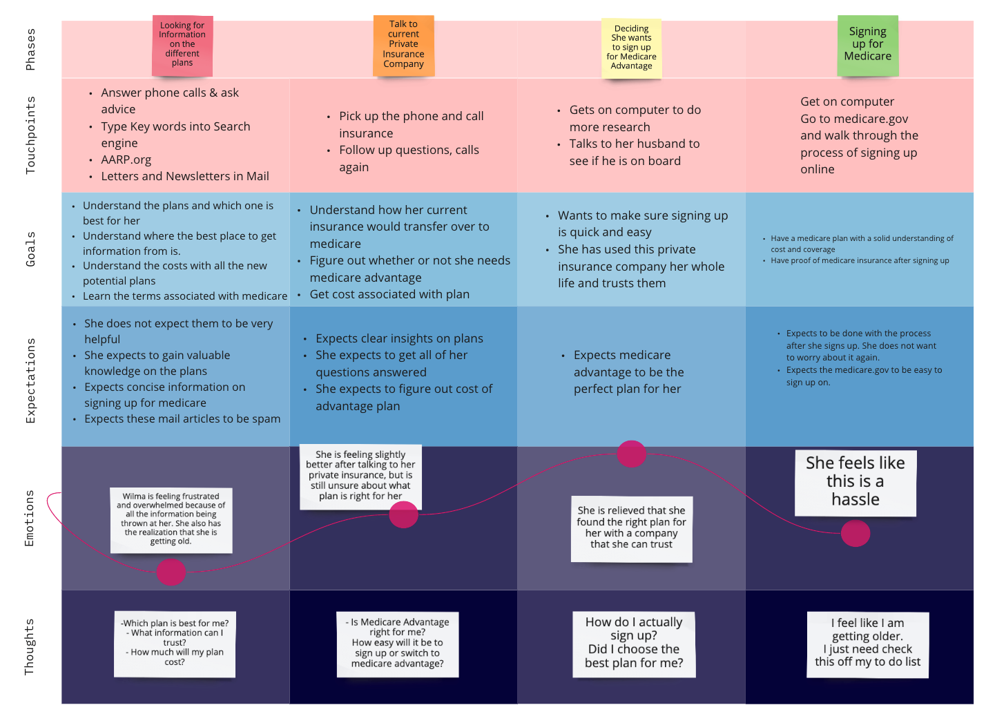
Experience Mapping
We created an experience map to summarize the current process of learning about and signing up for Medicare to present to our sponsors and refer back to understand the existing pain points, touchpoints, goals, and expectations of our users. This experience map was influenced by our primary and secondary research.
Ideation
We continuously sketched throughout the entire process in order to communicate our ideas and not get stuck on one solution.
Round Robin
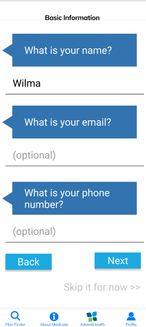
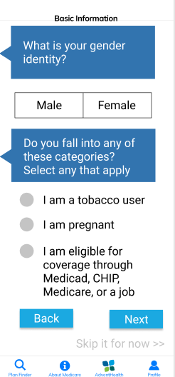
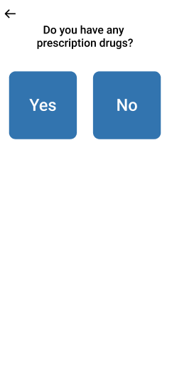
One method that our team used for rapid idea generation was a round-robin sketching activity where sketches from one member were passed to the next member of the team to ideate off of. In this specific activity, we ideated on what the onboarding experience would look like in order to narrow plans to create a more personalized experience.

Low Fidelity Prototypes
As a team, we split into two groups to create two different versions of our low-fidelity prototypes. These are the prototypes that I created. We created these to demonstrate the onboarding process of the application and the basic functionalities that would be present within the application.
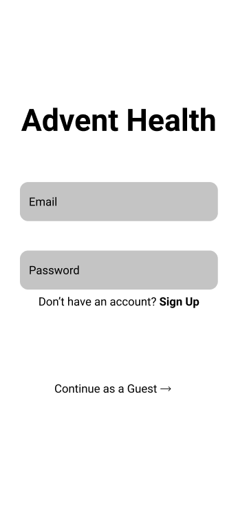
Initial Page
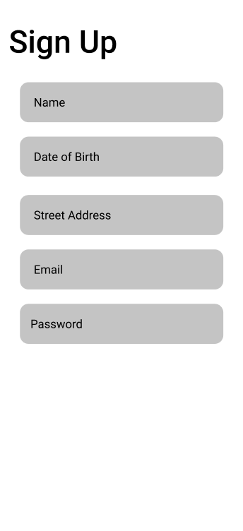
Sign Up Page
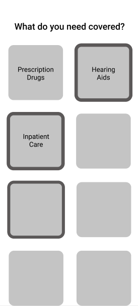
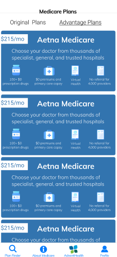
Narrowing Process
Plans that best fit User's needs
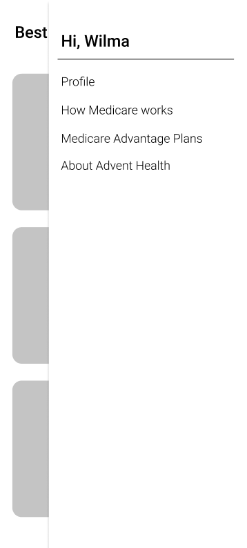
Menu containing all functionalities of the application
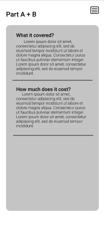
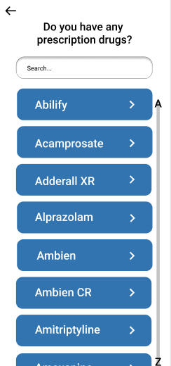
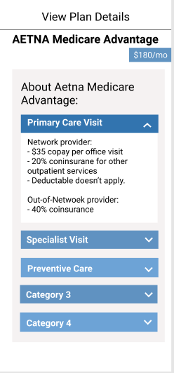
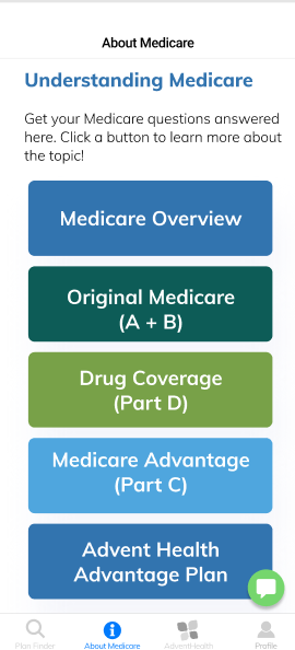
Medicare Information
How we Used our Research
- Included narrowing process to present plans that best fit the needs of our users.
- Made a simple and minimal interface with menu navigation so all functionalities were located in one place.
- Educational part of the application breaks down medicare into simple terms for users to reference as a guide when choosing their plan.
Mid Fidelity Prototypes
As a group, we came together to discuss our low fidelity prototypes. We combined our ideas by referring to our research and determining which ideas would ultimately benefit our user group. We completed three iterations of mid-fidelity prototypes to continue to improve on our designs.

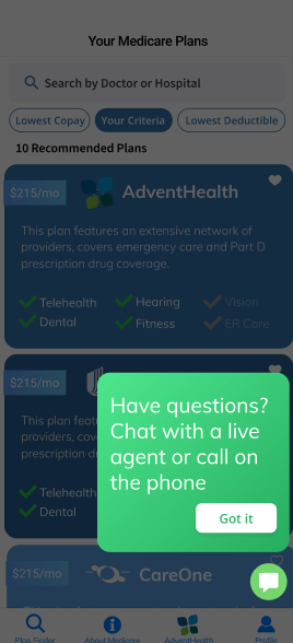
User Testing
We completed two rounds of testing, working to break our designs and find areas that we could improve our application for our users. In the first round, we completed guerilla testing for the first round and usability testing for our second round.
Round One: Guerilla Testing
Goal
Understand how users interpret the onboarding process of the application.
Approach
Each of the members of our team tested with two people, totaling 10.
How it Helped
We started the prototyping process with many different app entries. By receiving quick and informal feedback our team was able to determine the best onboarding experience for our users.
Round Two: Usability Testing
Questions for Testing:
- Does our application create a seamless onboarding flow with the ability to easily recover from mistakes?
- Do the users understand their location within their application and are the informational hierarchy make sense?
Approach
Conducted usability testing with ten participants between 52 and 60 years of age to get closer to our target user group.
What we Learned:
- Users need a way to filter plans even after the onboarding process to further accommodate their needs.
- More specific categories are needed within the navigation to help users predict what they will be able to do/learn on that page.
- Users wanted a page to learn about AdventHealth as a company.
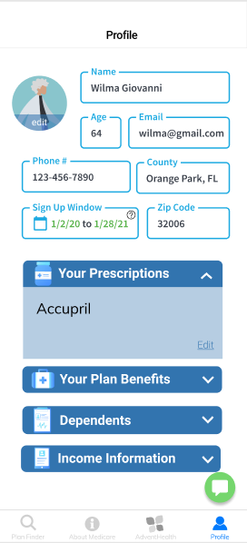
- Users wanted a more specific profile page where they could edit the selections they made during the onboarding process.
Final Design Changes
We completed multiple iterations on our prototypes based on feedback from our sponsor and our testing. Below I have identified some notable changes that we made in order to improve the overall experience.
Onboarding Additions
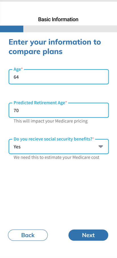
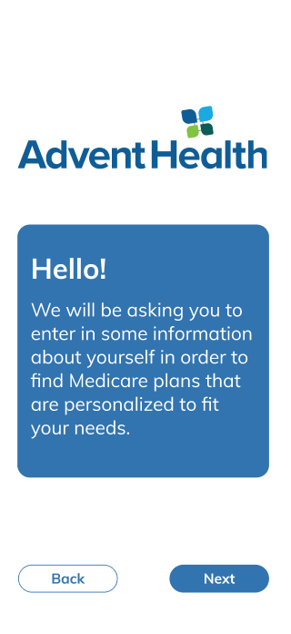
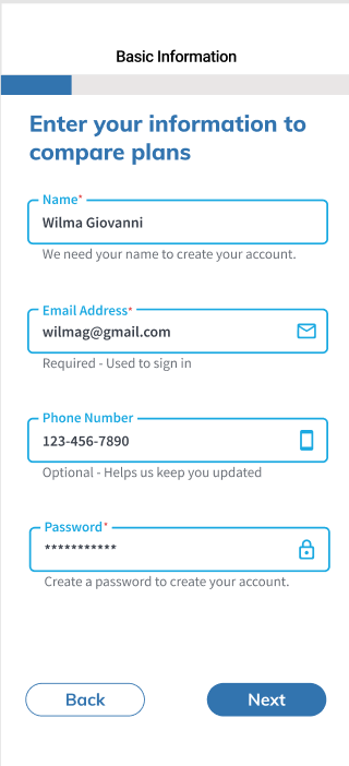
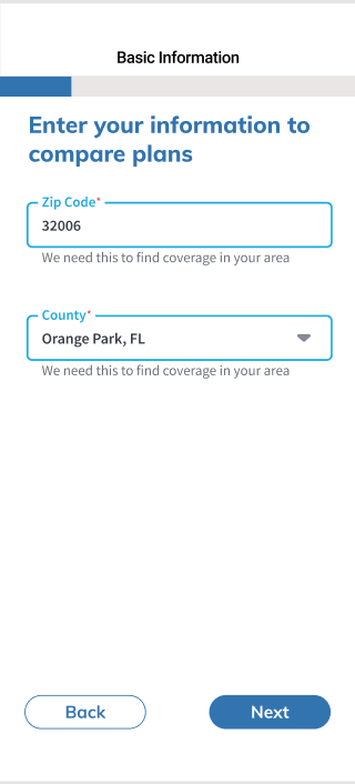
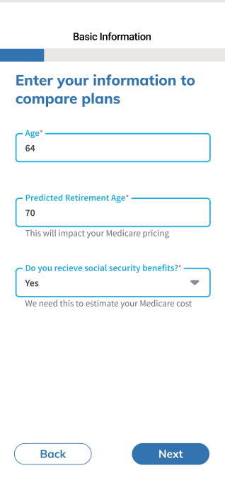
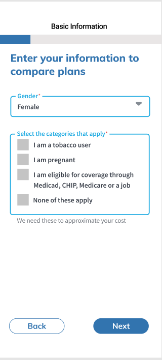
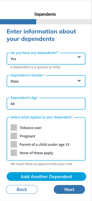
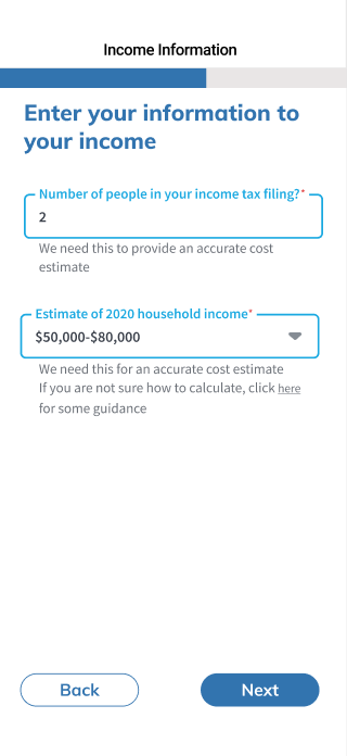
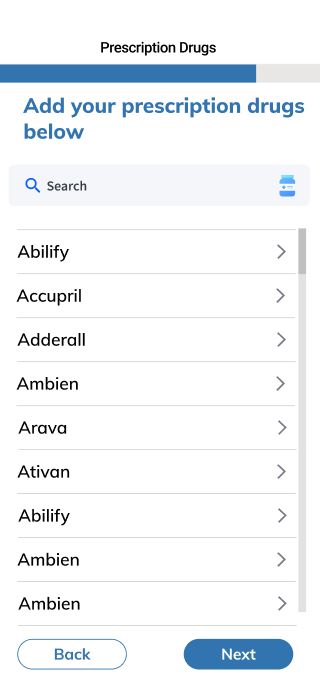
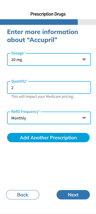
For the onboarding, we added a progress bar and descriptions of what the information would be used for. During our testing, we found that users were unsure of how long the onboarding was going to last. By adding a progress bar, the user is able to predict how much longer it will take for them to complete the process.
We added descriptions to help inform our users. During our secondary research, we found that users are skeptical of where they put their information. We wanted to present them with the purpose of this information.
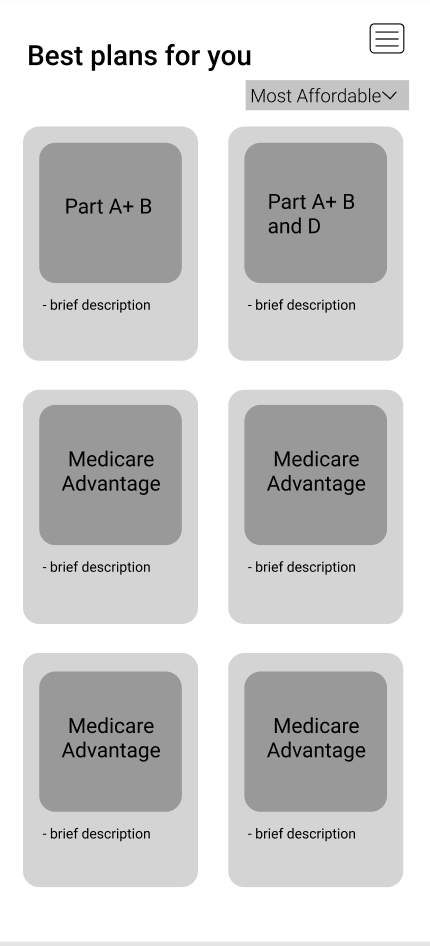
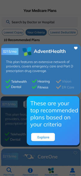
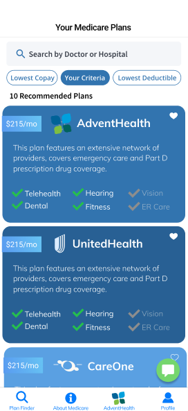
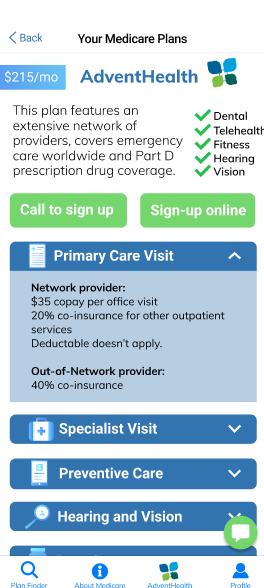
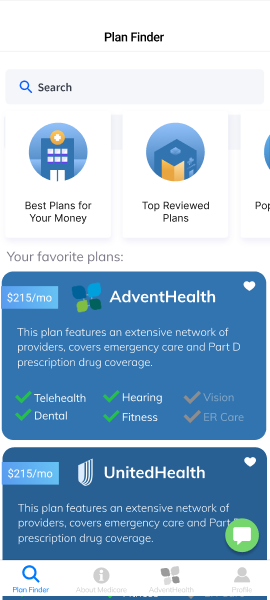
Plan Finder Changes
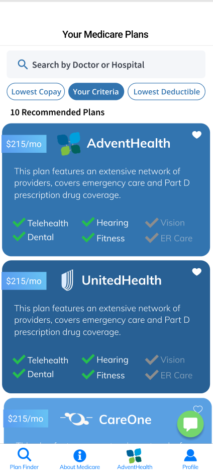
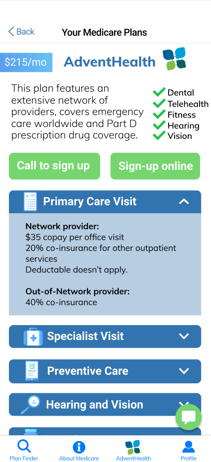
We edited the cards to show all of the options that the users requested in the beginning and highlighted which of those were fulfilled by the plan. This is something that was influenced by our user testing.
We also added buttons to call to sign up or sign up online. During our interviews, we found that it was very common for our user group to speak on the phone with a representative before deciding on a plan. We wanted to ensure that this option was visible and accessible to our user group.
Final Designs


Reflection
I really enjoyed this project because it was grounded very strongly in research. We accomplished a lot in a short amount of time and it was very important that we had strong research to refer back to. This is also the most that I have iterated on my designs in a project cycle. Medicare is a very complex topic, one that I was not familiar with before coming onto this project. I had to become a knowledgeable and dependable team member. I believe that this project truly will have an impact and improve the lives of people learning about medicare plans if implemented by AdventHealth.